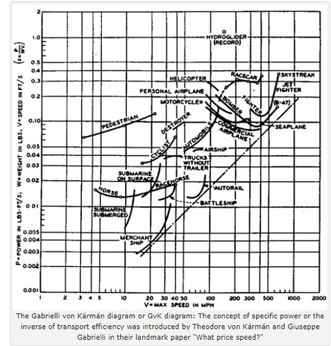
Have you ever heard of the Gabrielli - Von Karman diagram?
It was first introduced in 1950 by the famous aerodynamicists Gabrielli and Von Karman in their famous paper “What price speed”.
The diagram plots energy intensity (energy per unit mass per unit distance) against speed on logarithmic scales. Each mode of transportation, whether it’s a car, bicycle, plane, or train, plots as a curve or a point on this diagram, providing a quick visual comparison of their relative efficiencies.
It shows an interesting trend: for every mode of transportation, the energy intensity decreases with speed until it reaches a minimum point and then starts to increase. This minimum point is often the most energy-efficient speed for that mode of transportation.
By providing a way to compare the energy efficiency and speed of various modes of transportation, the Gabrielli-Von Karman diagram helps us understand the fundamental limitations and trade-offs between speed and energy consumption. This insight is valuable for informing policy decisions and driving technological innovation in transportation.
3 Likes
